Jenkins Visualization
Fuego test results are presented in the Jenkins interface via a number of mechanisms.
Built-in Jenkins status
Per-job data
Jenkins automatically presents the status of the last few tests (jobs) that have been executed, on the job page for those jobs.
A list of previous builds of the job are shown in the left-hand pane of the page for the job, showing colored balls indicating the test status. A green ball indicates that the test passed, and a red ball indicates that the test failed.
Build history
Jenkins can also show “Build History” pages for all tests, for the tests in a particular view, or for the tests for a particular node. The build history page for each of these selections will show a timeline chart with balls and job names indicating the time and status for those tests, as well as a status table indicating the results for the indicated set of items (all builds, or builds associated with a node or a view)
The build history can be dragged left or right to see different time periods of the build results. Drag the top portion of the graph to drag by days, and the bottom portion to drag by hours.
flot plugin for Fuego results
On the right side of the page for a job is an area where a chart (graph or table) will appear. Fuego uses a plugin (called ‘flot’) that it installs in Jenkins to provide visualization of Fuego test results.
For benchmarks, the results are shown as plots (graphs) of measure data, and for functional tests, tables are shown with either individual results for each testcase, or summary data for the testsets in the test.
See flot for more information.
Charting details
Fuego results charts consists of either plots (a graph of results versus build number) or tables (a table of results versus build number).
There are 4 different chart output options:
A plot of benchmark measures (called “measure_plot”)
a table of benchmarks measures and reference values (called “measure_table”)
A table of testcase results (called “testcase_table”)
A table of testcase summary counts per testset (called “testset_summary_table”)
A user can control what type of visualization is used for a test using a file called chart_config.json. This file is in the test directory for each individual test. See the wiki page for that file for additional details.
Scope of data displayed
By default, the page for a particular job shows the data for all of the specs and boards related to the test. This can be confusing, but it allows users to compare results between boards, and between different test specs for the same test.
For example, a job that runs the test Benchmark.bonnie, using the ‘default’ test spec job (e.g. board1.default.Benchmark.bonnie) shows results for:
Boards: board1, and also other boards
Specs: default, noroot
Measures: (the ones specified in
chart_config.json)
Detailed chart information
Internally, output (by the flot module) is controlled by a file
called: flot_chart_data.json
Inside that, there is a data structure indicating the configuration
for one or more charts, called the chart_config. This is placed there
during chart processing, by the results parser system. A section of
that file, the chart_config element, is a direct copy of the data from
chart_config.json that comes from the test directory for the test.
Information flow
The internal module prepare_chart_data.py is used to generate
flat_plot_data.txt. The data in this file is stored as a series of
text lines, one per result for every testcase in every run of the
test. This file is stored in the top level log directory for a
test. For example
/fuego-rw/logs/Functional.hello_world/flat_plot_data.txt has the
“flattened” test results for all runs of the ‘hello_world” test.
This file is then used to create a file called flot_chart_data.json,
which has the data pre-formated as either ‘flot’ data structures, or
HTML tables.
A file called chart_config.json is used to determine what type of
charts to include in the file, and what data to include.
Here’s a diagram of this data flow:
Note
Programs are in rectangles, and data files are the shapes with a curved bottom line. Items that are part of a test are in light purple. Items that are part of the Fuego parsing core are in light red. And the items in Javascript (or Jquery) that are integrated into Jenkins are in green.
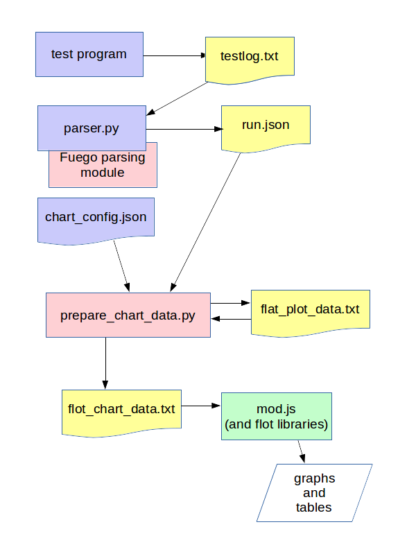
The flot program mod.js is used to draw the actual plots and tables
based on flot_chart_data.json. mod.js is included in the web page for
the job view by Jenkins (along with the base flot libraries and jquery
library, which flot uses).
measure_plot
A measure_plot is a graph of measures for a benchmark, with the following attributes:
title=<test>-<testset>
X series=build number
Y1 series=result
Y1 label=<board>-<spec>-<test>-<kernel>-<tguid>
Y2 series=ref
Y2 label=<board>-<spec>-<test>-<kernel>-<tguid>-ref
It plots measures (y) versus build_numbers.
Here’s example data for this:
"charts": [
   {  # definition of chart 1
     "title": "Benchmark.fuego_check_plots-main.shell_random"
     "chart": {
        "chart_type": "measure_plot",
        "data": [
          {
             "label": "min1-default_spec-Benchmark.fuego_check_plots-v4.4-main.shell_random",
             "data": [ ["1","1006"],["2","1116"] ],
             "points": {"symbol": "circle"}
          },
          {
             "label": "min1-default_spec-Benchmark.fuego_check_plots-v4.4-main.shell_random-ref",
             "data": [ ["1","800"],["2","800"] ],
             "points": ["symbol":"cross"}
          }
        ]
        # note: could put flot config object here
     }
 }
]
measure_table
A measure_table is a table of test spec with the following attributes:
row=(one per line with matching testspec/build-number in flat_chart_data.txt)
columns=test set, build_number, testcase value, testcase ref value, testcase result(PASS/FAIL), duration
Sort rows by testspec, then by build_number
Here was the format of the first attempt:
title=<board>-<test>-<spec> (kernel)
headers:
   board:
   kernel(s):
   test spec:
---------------------------------------------------------------
                          |    build number
measure items  | test set |   b1   |   b2   |   b3   |   bN   |
X1             |  <ts1>   | value1 | value2 | value3 | valueN |
X1(ref)        |  <ts1>   | ref(X1)| ref(X1)| ref(X1)| ref(X1)|
<bn>           |  <ts2>   |                ...
  (row-span    |  <ts2>   |                ...
as appropriate)|  <ts3>   |                ...
<b2n>          |  <ts3>   |                ...
And, ‘valueN’ is displayed in a correct color, e.g. GREEN if value1 is in the expectation interval specified by ‘ref’, otherwise in RED, so that we can display more info in a chart.
testcase_table
A testcase_table is a table of testcases (usually for a functional test), with the following attributes:
This shows the result of only one run (the latest)
Tim’s testcase table has: (one table per board-testname-testset)
overall title=<test>
header:
  board
  kernel version
  spec?
  filesystem
  test directory?
  command line?
--------------------------------------------
tguid | results
      | build_number |
      | b1 | b2 | bn |
<tguid1>|result1|result2|resultn|
     totals
pass: |    |    |    |
fail: |    |    |    |
skip: |    |    |    |
error:|    |    |    |
--------------------------------------------
testset_summary_table
A testset_summary_table is a table of testsets (usually for a complex functional test) with the following attributes:
row=(one per line with matching testset/build-number in flat_chart_data.txt)
columns=test set, build_number, start_time/timestamp, testset pass count, testset fail count, duration
Sort rows by testset, then by build_number
title=<board>
headers:
   board:
   kernel(s):
-----------------------------------------------------
                          |    counts
build number   | test set | pass | fail| skip | err |
<bn>           |  <ts1>   |
  (row-span    |  <ts2>   |
as appropriate)|  <ts3>   |
<b2n>          |  <ts1>   |
               |  <ts2>   |
It shows testset summary results by runs
Structure of chart_data.json
Here’s an example:
{
 "chart_config": {
    "type": "measure_plot"
    "title:": "min1-Benchmark.fuego_check_plots-default"
    "chart_data": {
       data
}
Planned for the future
In future releases of Fuego, additional chart types are envisioned:
A fifth chart type is:
A plot of testcase summary counts per testset (called testset_summary_plot)
testset_summary_plot
A testset_summary_plot is a graph of testsets (usually for a complex functional test) with the following attributes:
title=<board>-<spec>-<test>-<kernel>
X series=build number
Y1 series=pass_count
Y1 label=<board>-<spec>-<test>-<kernel>-<testset>-pass
Y2 series=fail_count
Y2 label=<board>-<spec>-<test>-<kernel>-<testset>-fail
It graphs testset summary results versus build_ids
Feature deferred to a future release
Ability to specify the axes for plots in chart_config
Ability to specify multiple charts for a single result data set in chart_config
Architecture for generic charting
This section has notes about how the current data and structures can be manipulated in a generic way to generate charts with different layouts and fields. This is for reference for future implementation of additional chart types in the future.
Assuming you have a flat list of entries with attributes for board, testname, spec, tguid, result, etc., then you can use treat this like a sql database, and do the following:
Make a list of charts to build
Have a chart-loopover-key = type of data to use for loop over charts
Or, specify a list of charts
Define a key to use to extract data for a chart (the chart-key)
For each chart:
Make a list of rows to build
Have a row-loopover-key = filter for rows to include
Or, specify a list of rows
Define a key to use to extract data for each row
If sub-columns are defined:
Make a sub-column-key
Make a two-dimensional array to hold the sub-column data
For each entry:
Add the entry to the correct row and sub-column
Sort by the desired column
Output the data in table format
Loop over rows in sort order
Generate the html for each row
Loop over sub-columns, if defined
Return html
There’s a similar set of data (keys, looping) for defining plot data, with keys selecting the axes.